Friday, February 26, 2010

Photo Friday: Positive/Negative Space

Today's Photo Friday can be done no matter what type of camera you have! We're talking about positive and negative space.

Negative space is defined as "the space around the subject of an image." and positive space is your actual subject. If you're more visual, in the photo below the black area is negative space and the baby is the positive space . Areas of a picture that contain "nothing" are important visual elements that provide balance in an image.

Photobucket

Why do we care about this? Sometimes I think we are so caught up in just TRYING TO GET THE PICTURE that we forget about the space around our subject. Especially with children, I think having negative space around them makes them look little (and helps us focus on their faces instead of our unfolded laundry in the background) Don't forget to look up or down to find some clean spaces--sometimes the sky or even your carpets work great!

Used correctly, your negative space should compliment not compete with your subject.

Settings note: Having your camera set to a lower aperture also helps to blur out your background and really make your subject stand out as that positive space.

The Image Is Found are photographers who ROCK at positive/negative space. This session for example.

A couple examples:

Photobucket

Photobucket

Photobucket

Go out and try it!

{this is where I would write something about making negative space a positive experience, but I won't. That would be cheesy}

Wednesday, February 24, 2010

Kate: Two Ways

Silent.

Photobucket

LOUD!

Photobucket

Those seem to be the only two settings she came with.

Saturday, February 13, 2010

Photo Friday: Adding Contrast In Photoshop

Hey! I guess I don't do regular updates on this blog anymore. Photo Fridays are just so much more fun.

I had a questions about which type of editing software to use (Picasa vs. Photoshop Elements vs. Photoshop Premier?) I personally have Photoshop CS3. It took me a long time to figure out how to use it and still I think I only use about 10-15% of it. I think Photoshop Elements is a great place to start with basic editing to your pictures.

That being said, I was recently at a friends house and got to play around with her Lightroom program. IT IS SO EASY! I would say if you want to quickly be able to edit your pictures without learning a bunch of Photoshop talk, give Lightroom a try. You can even download a trial at the Adobe website.

Today I'm going to show you how to add contrast to your pictures in Photoshop.

In Photoshop go to Image --> Adjustments --> Curves

Photobucket

Once in there, you'll see a box like this ...

Photobucket

See the way the line curves? That's called an S-Curve. To get that, click on the line right in the middle. Photoshop will put a dot where you click. After the first click, click again to the left of that one (there is a dot where I put mine) and pull it 'til the line makes an "S." You'll see the photo changing as you do this and after a little playing with it, you'll be a contrast adding pro.

Here's the thing. I use my contrast very sparingly on color pictures. I don't think I would have added quite this much contrast if I wasn't showing it as an example.

Black and white pictures is where I really think contrast shines. I love deep, dark black tones and bright whites. So here's what I do--I convert my pictures to black and white first, using Images --> Adjustments --> Black and White.

Photobucket

I know! This kind of a flat, blah black and white. Use the same method I explained above to add contrast to your black and whites. Again, for this picture just a small amount of contrast works.

Photobucket

See? Much better, right?

Photobucket

Let me know if you have any questions. I'd also love to hear anyone's experience about various editing programs!

Friday, February 5, 2010

Photo Friday: ISO

Warning: Photo Fridays are random. If you have a question and would like me to answer, leave it in the comments or email me. The email button is over there! ---------->

Links to more camera subjects at the bottom of this post.


Today I'm talking about ISO.

The acronym ISO refers to the International Standards Organization. But we really don't care about that. In basic terms, ISO is a way to adjust how sensitive your camera is to light.

Check out your camera's manual and see how to change your ISO setting. You'll see a few options. 100 is the lowest ISO for most digital cameras and 800 is the highest for most non-pro DSLRs.

If you set your camera on the lowest ISO (100) you are telling your camera that you have lots of light to work with. This is a great setting for a sunny day, shooting outdoors. If you don't have quite that much light (for example if you're outdoors, but it's cloudy) you should bump your ISO up a little, to the next setting (200). Heading indoors? Better go up to 400. You might even need to go all the way up to 800or 1600 if your camera will let you, depending on how much indoor lighting you have. By setting the camera on a higher number, you're telling the camera "Hey, I don't have much light to work with here, so I need to you to be really sensitive to what light there is!"

Are you thinking "Why do I need to worry about ISO when I have my flash? Flash brightens everything!" Because flash sucks.

Most people have cameras with flashes that pop up whenever there isn't enough light to shoot with. Direct, on-camera flash is the worst thing you can do to your photos. It's harsh, it's unnatural looking and doesn't it totally make whoever you're photographing blind? Stop using it. Instead of popping the flash up, change your ISO. Your results will be better, I promise.

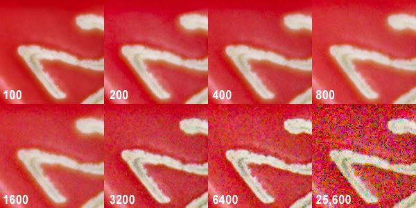
One downside about shooting at high ISOs is the "noise". The higher ISO you use, the grainier (or noisier) your photos will be. Here's an example of a photo shot at different ISOs. See how the grain (noise) increases as you take your ISO higher?

Photobucket

For me, the trade-off is totally worth it. I'd rather have my image a little grainier than use that blasted flash.

Here's a recent example. While at the Experience Music Project, my family was recording a fake CD. It was really dark, but the light in the sound booth was this awesome pink color. If I had used my flash, it would have blinded Colin and blown out the existing light. Flash=suck.

Photobucket

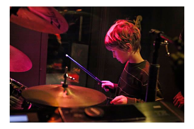
So I bumped up my ISO to 6400 and shot! Sure, it's a little grainier than usual but to me it's a great trade-off.

Get out your cameras and play with your ISO. Feel free to link to some of the pictures you took!

Learn more about aperture here and shutter speed here.

LinkWithin

Related Posts Widget for Blogs by LinkWithin